Tuesday, 5 April 2011

Final Evaluation


I chose to do print based coursework with the genre soap opera:
• pre-production - two magazine covers (different target audiences: teenage girls, 11-16 & young women, 23-29)
• production - magazine cover & double page feature article (target audience 16-25, young women)

I chose to do Soap Opera as I was most familiar with it and felt I had most experience with it in the media and print as I was most experienced with the software needed: Photoshop
I researched four magazines: two women's (Look & Company) and two TV guides (tv choice & RadioTimes)
Each of the TV guides within the categories are from opposite ends of the market, so I could see where I wanted my product to lie within the market.

I created questionnaires which were sent to appropriate age range, within my target audience, which included questions about my production, and media interests in general, and within the market of magazines. Refer to post: Monday, 29 November 2010

I used the results I collected to improve my ideas for my production (background, magazine name, price, colour scheme). So the most popular choices were the ones I used, so that my magazine would appeal to my target audience of young women (17-26 years old)

I researched intertexts with similar audiences to my production – soap opera and women’s magazines (to combine and create a women’s TV guide), so that my magazine would have the oncventions needed for it to appeal. I also helped me to write my article in the right style and format.

My productions general weaknesses are: it looks more professional in some areas of the magazine cover than others, composition of the cover does not look natural in some areas, cover composition is more conventional of genre and target audience than article

My productions strengths are: successful colour scheme and background for target audience, conventional elements and successful layout for a women’s magazine and TV guide combined

I used Photoshop and Microsoft publisher to produce production as I am familiar with both programmes and they produce professional looking pieces of work,
My skills are more apparent in my production compared to my pre-production pieces, as I was more practised wioth the Photshop software when it came to creating my production.

I seeked more experienced help from a frequent Photoshop user, improved my own skills (wanted production to look professional – saved time knowing what and how I could achieve it)

Layering of images and layering styles (shadowing), isolation of images from their original background, repetition of a single image to create a background, adjusting images (contrast – lightening shadows/midtone contrast/darken highlights, colour – saturation/hue/temperature/tint)

In terms of detailed analysis of my production:
 - the lower banner is weaker in appearing professional than the rest of the cover
 - the barcode is misplaced – doesn’t fit with the rest of the composition
 - title of magazine is stretched too much upwards, but not enough width to expand it – looks disproportional
 - shape of the side stories compliment the main photograph

Intertexts I used were: Company, Look, RadioTimes and tv choice. I researched reviews of both of the TV guides, as those were the magazines that would most closely match my magazine in terms of content. (the reviews I chose to look at most closely are featured on my powerpoint under the section: intertext research)
As well as reviews, I also looked closely at the bakcground information for all of the intertexts (informtation also featured on powerpoint under same section as above)
Below is an image of my final draft for my magazine cover:
Here are my final pages for my double page feature article: 
I didn't have this banner in my first few drafts and I am glad I added it, with the guidance of my feedback, as it makes my cover look more professional as it is conventional of a TV guide.

Friday, 25 February 2011

Second Draft

 Below, are images of my second draft of my production: A front cover and double page feature article.


Friday, 18 February 2011

Continued Improvements on my Production

So far, in order to reach my next deadline, I have corrected the grammatical and spelling errors in my article on'Pauline Fisher'. I am also revising the narrative, so that I have more/less detail where appropriate, accordingly. I have also started to re-draft my magazine cover, adding a banner and tagline. I also hope to add a 'puff' in the top corner and more storylines.

Friday, 11 February 2011

Improving my Production

I have recieved teacher feedback for the first draft of my Production.
Below is a list of improvements for my Magazine front Cover:
  • addition of a slogan near my magazine's name
  • addition of a 'puff', in the top right hand corner
  • big, bright colours needed
  • decrease size of the barcode and move it to the bottom of the cover
  • date of release & issue no. need to be smaller and immediately below the magazine's name
  • adjust the background colour 
  • create a straplin at the bottom of the cover
  • explain who minor models on the cover are
  • 'splash' the main article in a banner across the middle of the cover
I have also been given improvements to make on my article:
  • replace words such as: urged, unfolds, all-revealing (doesn't make sense) and viewers with alternative, more conventional words e.g. uncovers
  • revise some quotes, so that they make more grammatical sense
  • resolve small typing errors
  • addition of background information e.g. the drugs, rehab and miscarriage
  • addition of information on the effect of her return on Ramsay Street
  • overall, lengthen the article
I agree with all the above imrovements and believe that I can resolve all of them in time for my deadline for the second draft.

Friday, 4 February 2011

Production - First Draft, continued

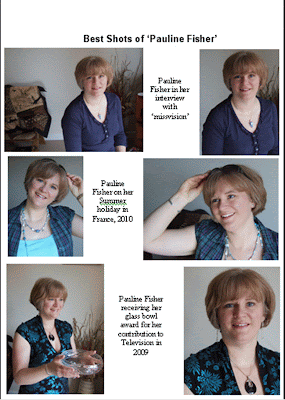
I have completed a detailed plan for my Double Page Feature Article, an interview with 'Pauline Fisher', who plays 'Rachel Yong' in the Australian soap neighbours. Below are the pages of my plan.


Thursday, 3 February 2011

Production - First Production

I have my first deadline for my Production (Front Cover & Double Feature Article), and in this post I have included all the work I have done to meet this. Below is a draft of my front cover:

Friday, 21 January 2011

Pitch Presentation

I gave a presentation to pitch my production piece ideas, to my A Level Media Studies class and teacher and I was given reflection feedback on the quality of my ideas.
The constructive criticism was:
  • to improve the clarity of my target audience (broaden age width)
  • reconsider the colour scheme of my production (on the basis of my pre production)
  • confirm what the double page feature article will be about/consist of
  • confirm who my models will be
  • confirm what the headlines featuring on the front cover will be
I feel that since pitching my magazine, I have improved my understanding of what my article will be like/about, shown by the planning in my previous post.
I still need to consider my target audience, colour scheming and exact wording of headlines.
However, I fell that I will delay headlining and colour scheming until I have established my article, and start to plan my front cover.
The commended features were:
  • appropriate and original title of magazine
  • good quality and realistic pre productions
  • constructive use of results from questionnaire
  • an achievement of effective skill in using photohsop
  • organised element to my planning
I am pleased that people recognised the professionalism of my pre productions, as I put effort into making them look realistic. Also, I am glad that I used my questionnaire results constructively, in the eyes of my peers.
Above is my planning for the layout of part of my production piece: 'double page feature article'.
On the left, I have planned the sequence and inclusion of my writing, giving me a basic overview of what my article should consist of when I come to write it.
On the right, I have planned the layout of the article itself, so I have a plan for when I have finished the writing of the article, and start to construct the production.
In order to produce both of these documents, I used examples of TV guides, that I'd bought in order to ensure my pre/production appeared accurate, to create a narrative and layout for myarticle. These TV guides were: 'TV Choice' and the 'Radio Times'. These magazines are from opposite ends of the market with 'TV Choice' being the lower end, as I see my magazine to be between this price ranges. I have decided this because I don't think there is a magazine that is produced for demographic group D/C with Psycographic group 'mainstreamer'.

Thursday, 20 January 2011


Above are images of my pre-production pieces: missvision (young women) and teenvision (teenage girls)

Sunday, 9 January 2011

Planning my Production Piece

I have started to research TV guide feature articles and have discovered that the majority of them are interviews and I will do this too. Interviews are generally considering a new TV series, but as my genre is Soap Opera I will 'interview' someone returning to an already developed programme (soap opera). For example, Delta Goodrem being a 'not so new neighbour' arriving at Erinsborough (in Neighbours) and an interview discussing her past experience on the show as well as her wish to return.